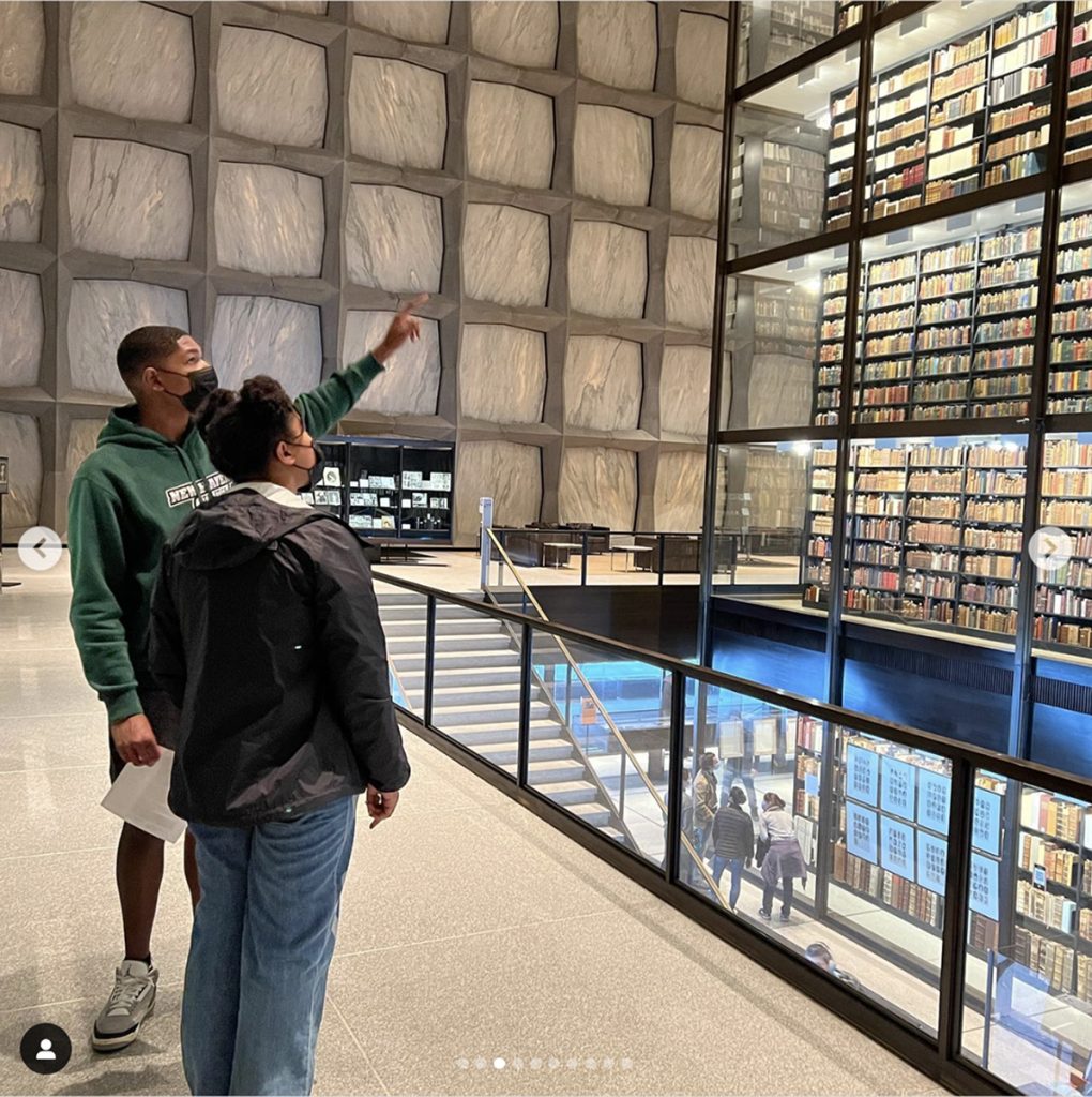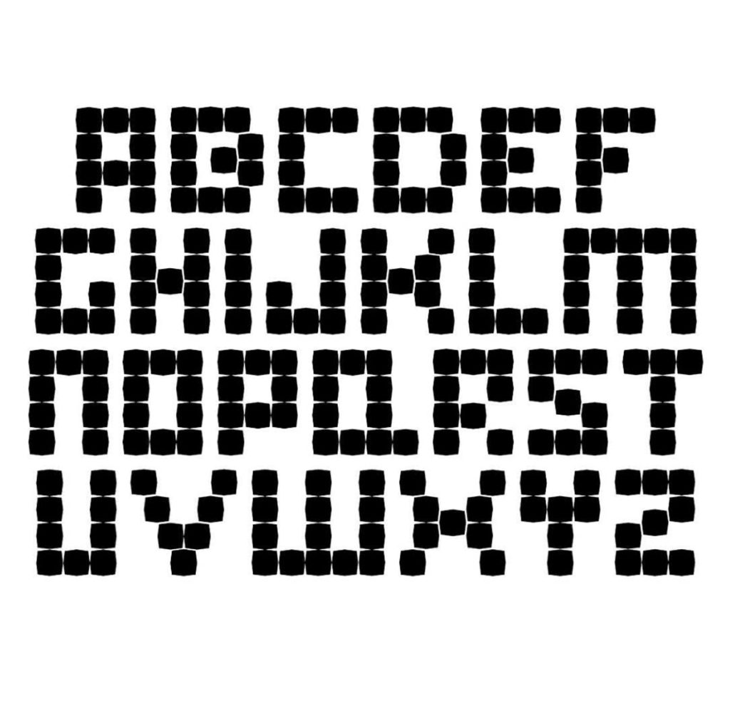
In another installment of showing my work from @yaleschoolofart, what started as a trip to the @beineckelibrary with @walkerthealchemist and Drew resulted in a three-part project for an anthology class. The project scope requested the creation of a display typeface to represent a literary collection of your choice. On our visit to the library, the kids were able to see and interact with personal artifacts belonging to Langston Hughes (his writing pen, custom made wallet, and his teaching copy of “The Weary Blues”) as well as personal and literary items belonging to James Weldon Johnson. The anthology aptly named “In the Deep of the Stacks” inspired a font-family named Stacks. Shown here, Stacks Bold serves as a metaphor for the library itself; a fantastical and imposing structure that holds rare books and manuscripts including many canonized Black American Literary Heroes and the reality that access to these artifacts is challenging. Much like bibliography detail, this typeface becomes more legible the smaller it gets.


